
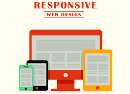
Responsive Web Design
Responsive web design is an approach that suggests that design and development should be based on user behavior and environment based screen size, platform and orientation. This means that if the user shifts the usage from mobile to laptop, the website should automatically adjust to the new screen size, resolution scripting and image

Application Migration
Application migration is a process of shifting an application from one environment to another, for example migration of an on premise enterprise server to a cloud provider’s environment and vice-versa. This is a complicated process as while migrating an application from one environment to another, some changes are bound to occur. Since the
Designing Mobile UI
Smartphones and tablets have taken the world by storm lately. Almost everyone uses a smartphone or tablet in today’s world. Due to the large number of users, the mobile applications have also gained a lot of popularity. This further leads to the need of having an interactive User Interface (UI) on the mobile
WordPress Optimisation For Better SEO
In today’s world almost all the applications are web based. Every company these days handles the website using WordPress for better business results. These websites need to be constantly monitored to ensure the maximum benefits. Even a website with great UI and world-class standards can become a big failure if the search engines
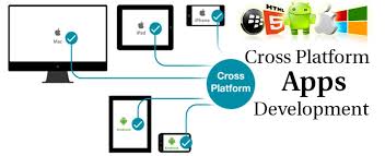
Cross-platform Mobile App Development
With the advent of smartphones came in the apps which changed the way of people’s lives. Nowadays, all popular mobile platforms offer a wide range of mobile applications that serve various purposes. Some apps are designed specifically for one platform which are not genuinely available on the other smartphone platforms. Here arises the